Velo-City: Vancouver & the Bicycle Revolution Direct Mailer & Rack Card
Client
Museum of Vancouver
Background
Working with the Museum of Vancouver’s (MOV) pre-existing graphic standards guide, students were required to create a direct mailer and rack card for any of MOV’s current or past exhibits.
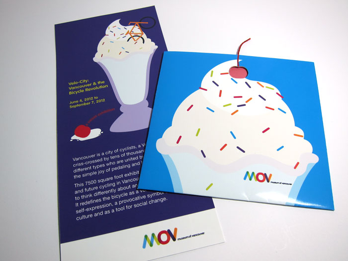
I chose to focus on the Velo-City exhibit, which highlighted the bicycle culture of Vancouver.
Target
Local bicycle enthusiasts, aged 25-40, whose main driving force behind their enthusiasm is personal enjoyment; they have fun riding their bicycles.
Concept
Using metaphor, the bicycle exhibition is presented as a sweet treat to be enjoyed by the visitor through comparisons to ice cream and its various related toppings. This playful concept is reinforced through the use of illustrations and various ice-cream related headings.
This design will appeal to the target audience because its presentation of the bicycle exhibition as an ice cream treat aligns with their main motivation for bicycle riding—personal enjoyment.
-
Rack Card & Mailer
-
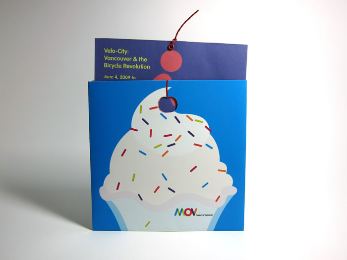
Mailer with die-cut
-
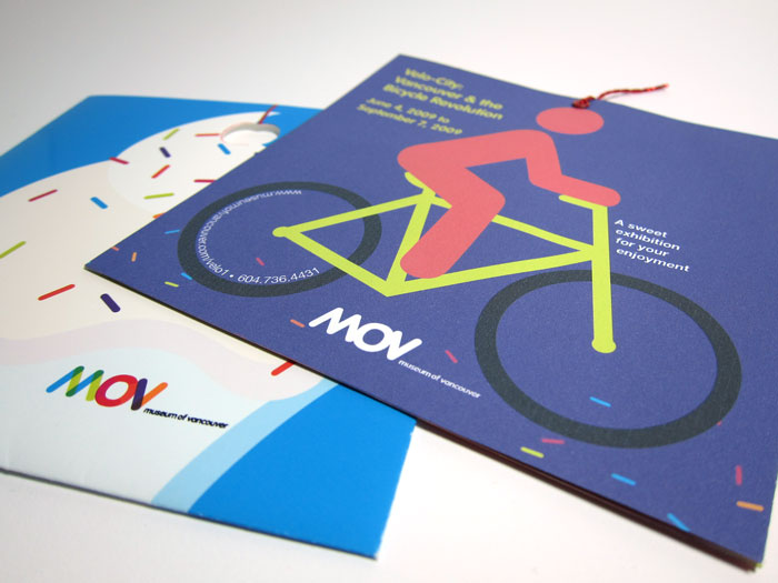
Brochure Cover
-
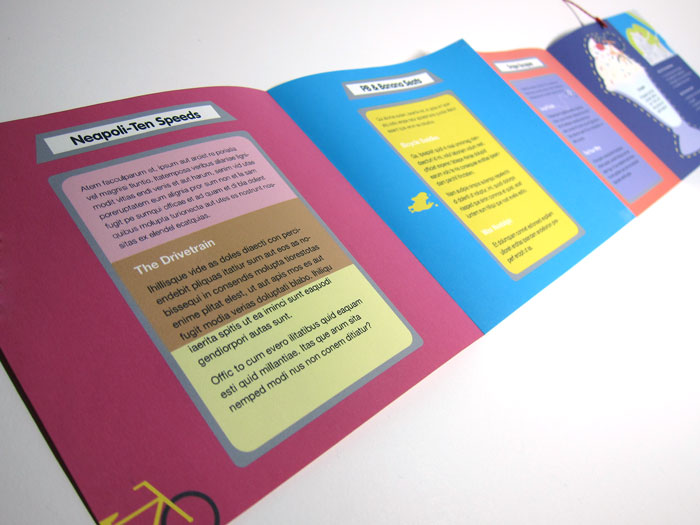
Brochure Inside